top of page

ריהוט אונליין
PROJECT
SUMMARY
Rihut-Online
site renewal
MY ROLE
UX Design
UI Design
I helped positioning Rihut-Online site as a virtual store. Improve the experience of clarity, control, reliability and gave a trendy look that support that experience.

CHALLENGE
Rihut-Online is a virtual store for low-coast good quality furniture. The challenge was to improve the experience of clarity, control, reliability of the site and to give a trendy look for a more fun and quality experience.
Project Goals
1
2
To improve the message of the site by minimizing or get rid of the parts that contradict the purpose of the site.
3
Increasing the fidelity sense of the user by adding a review and voting line.
5
4
Create a loyal customer base by improving very basic rules in virtual store experience.
Design system that support
sense of quality, reliability and control.
Creating clear and simple experience of the site by prioritizing and deciding what is crucial and what can be deleted.

APPROACH
To gather insights on the current Site experience from customers, staff and manufacturer’s, with a focus on both long term and short term states.
Working Methods
Market research analysis
Persona
Customer Journey
Information Architecture
Personas
On synthesizing our customer research we could define 2 key personas
Our first flat
Ortal and Omer just made a move of sharing their first flat and want to furnish it together. They want a cool and trendy living room.
We're getting a big family
Cohen family - Tamar and Evyatar
and their children Yael (11) Ori (7), expecting for twins.
They had some changes in the house for adjusting it to the new situation. After finishing the renovation they began to search some furnitures that suits their budget.

IMPLEMENTATION
Applying the solutions in wireframes and after on design mockups, ready to test stage.
Homepage

One main search engine in the left side separated from the main navigation.
Big banner for highlighting stores products or sales.

Catagories filtration:
Main navigation categories prioritized as rooms that open
to sub mega menus with two filter options: style / model
Reviews and votes of other users
Product page
One big shot of the Product and 4 more from a different perspective
Details about all the aspects of the product and delivery
Added picture of the product
with size information
Delivery type options button
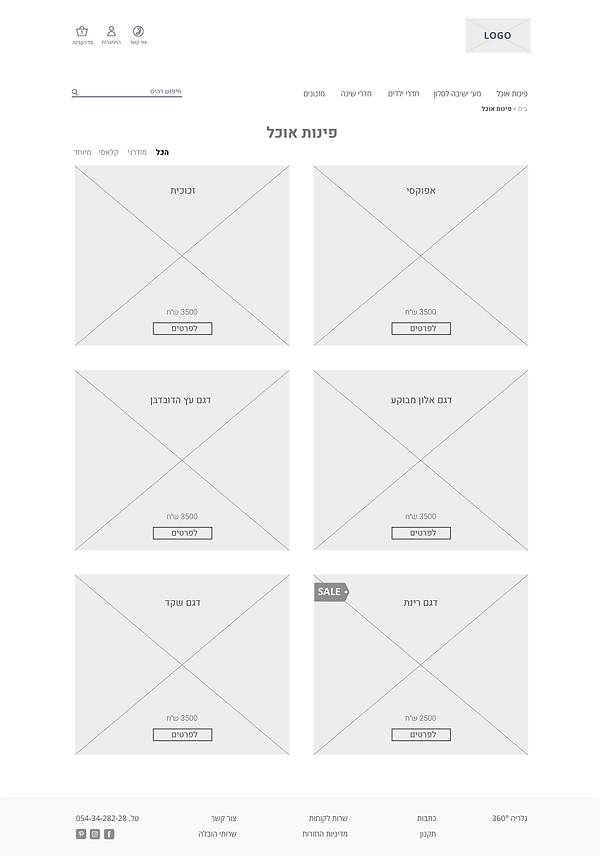

Category page
Division of two big horizontal catagory product square which contains big beautiful picture of the product.
Filtering by style type or all the models
Designing
Fine typography
Color system that supports the minimalist design
Lifestyle photos of the furnitures
New logo
Repeated design element that support the consistency

bottom of page